Overview
Redesign of the end-to-end checkout flow to reduce friction, improve usability, accessibility, and completion rates.
Rolled out across 4 brands (Penhaligon's, L'artisan Parfumeur, Kama Aryurveda, Loto del Sur).
Challenge
Contentsquare analysis highlighted significant drop-offs across checkout, especially during sign-up and delivery address stages.
Unnecessary friction caused by long, multi-step flows and complex form inputs.
Tools
Figma — Design
Figjam — Research, Planning, User flows
Contentsquare — Analysing data, viewing user replays
Process
- Analysed data from the existing checkout flow to identify key pain points, friction, and drop-off points.
- Researched best practices using the Baymard Institute checkout guidelines and competitive benchmarks to inform potential improvements.
- Mapped the end-to-end user flow to visualise simplification opportunities.
- Presented insights, recommendations, and proposed solutions to stakeholders to secure alignment, resourcing, and delivery sign-off.
- Collaborated with the Business Analyst and Project Manager to define requirements, constraints, and success metrics.
- Designed and iterated on solutions through multiple rounds of feedback, balancing user needs, technical constraints, and business goals.
- Launched the new checkout as an A/B test against the existing flow.
- Following positive results, partnered with engineering to brief on the final solution, support delivery, and ensure build quality.
- QA’d the implementation across devices and scenarios before releasing to the live site.
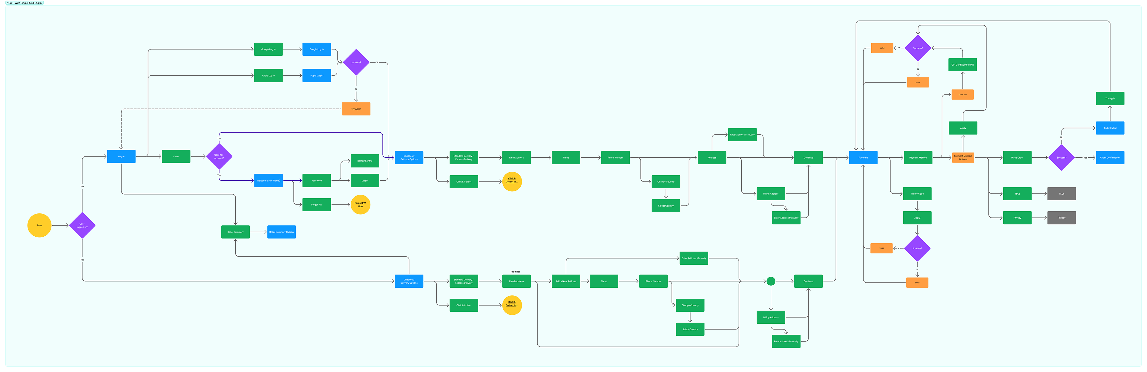
User Flow
Solutions
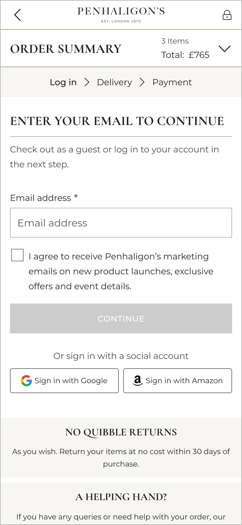
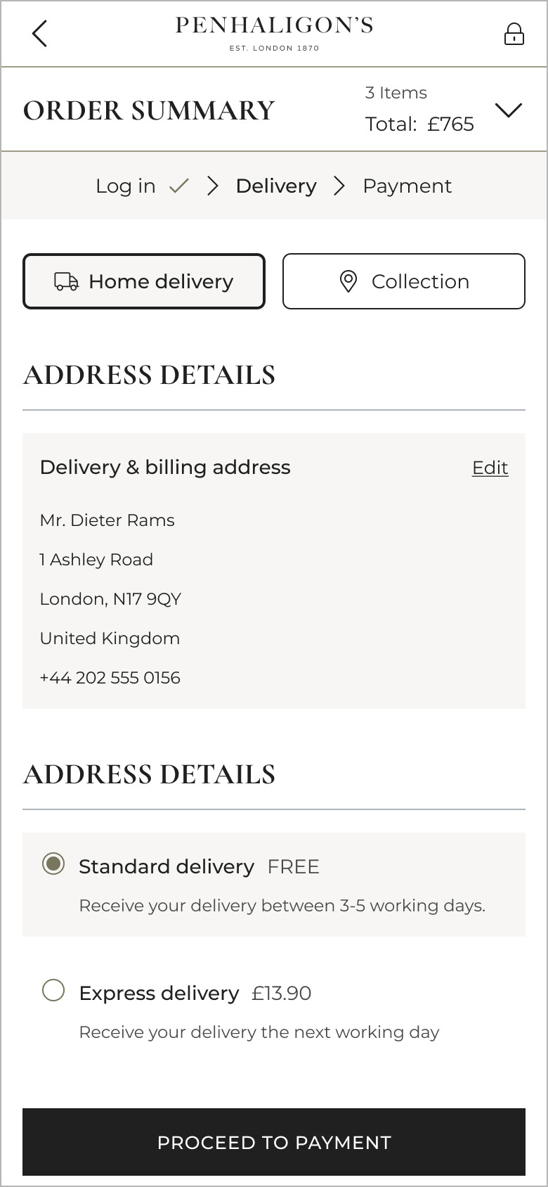
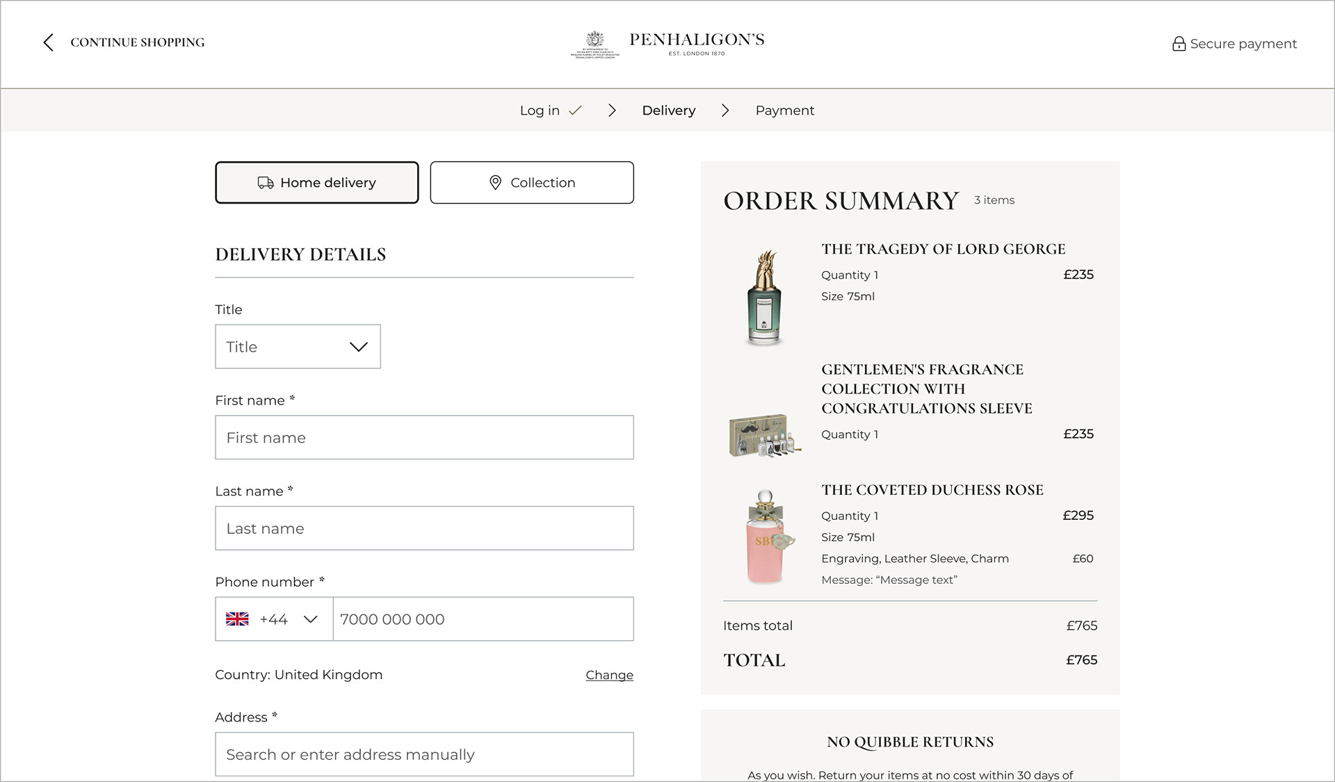
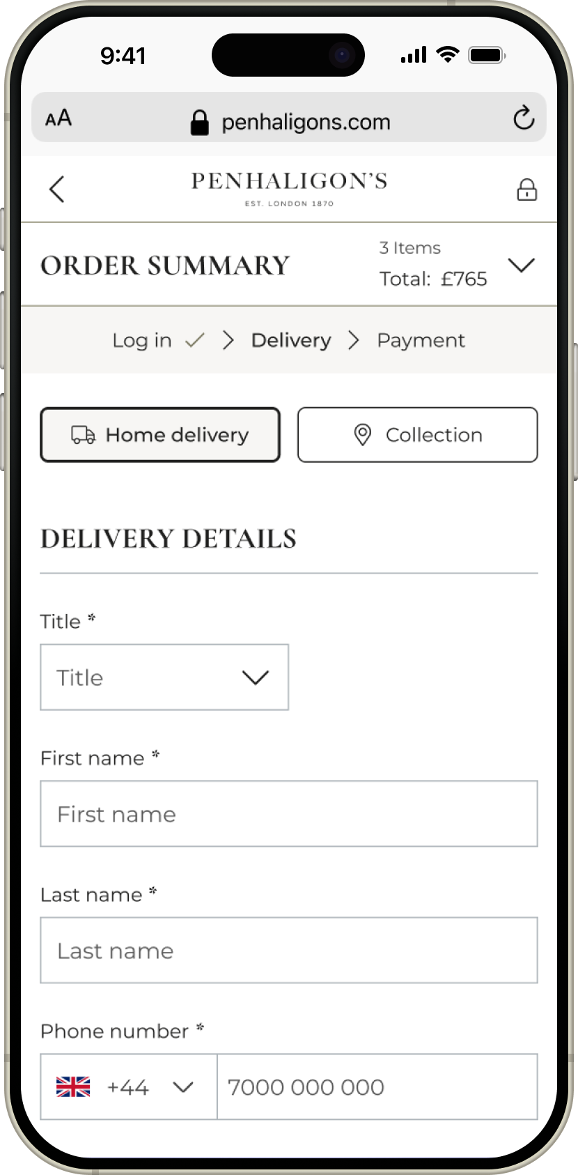
Steps indicator — Introduced a clearer progress indicator to show the total number of steps and the user’s current position in the journey.
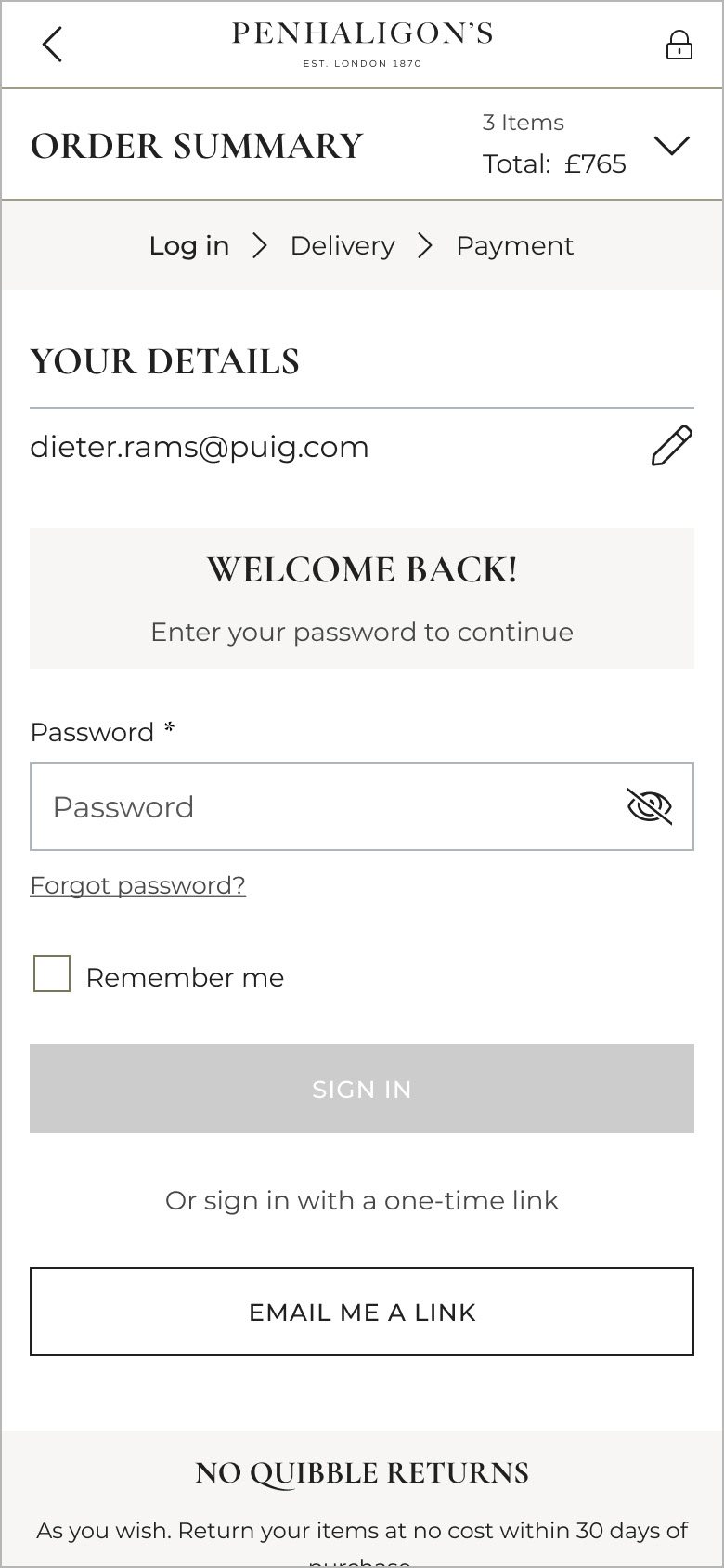
Log in — Replaced separate Guest and Account inputs with a single email input. If an account existed, the password field was revealed. Otherwise, users continued as guests with the option to create an account at the end of the journey.
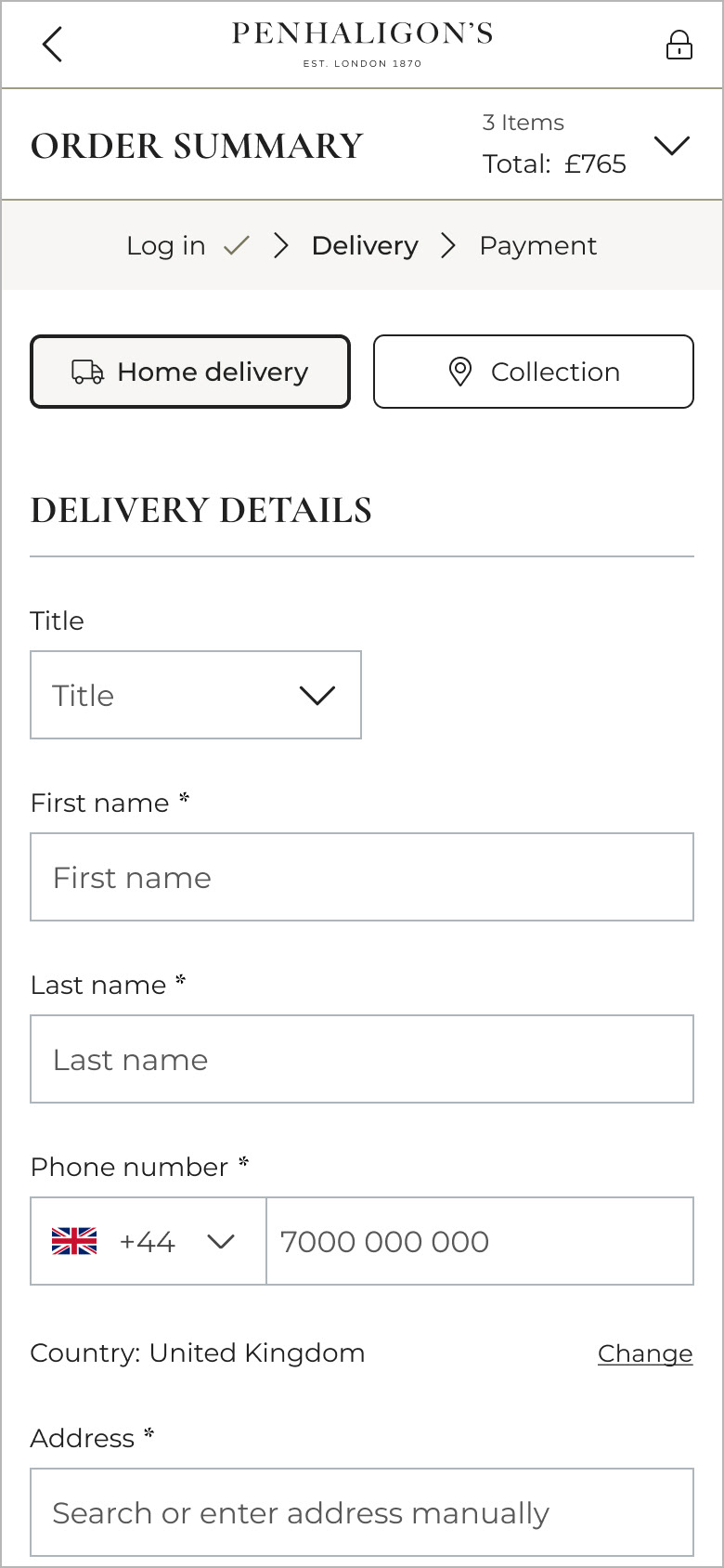
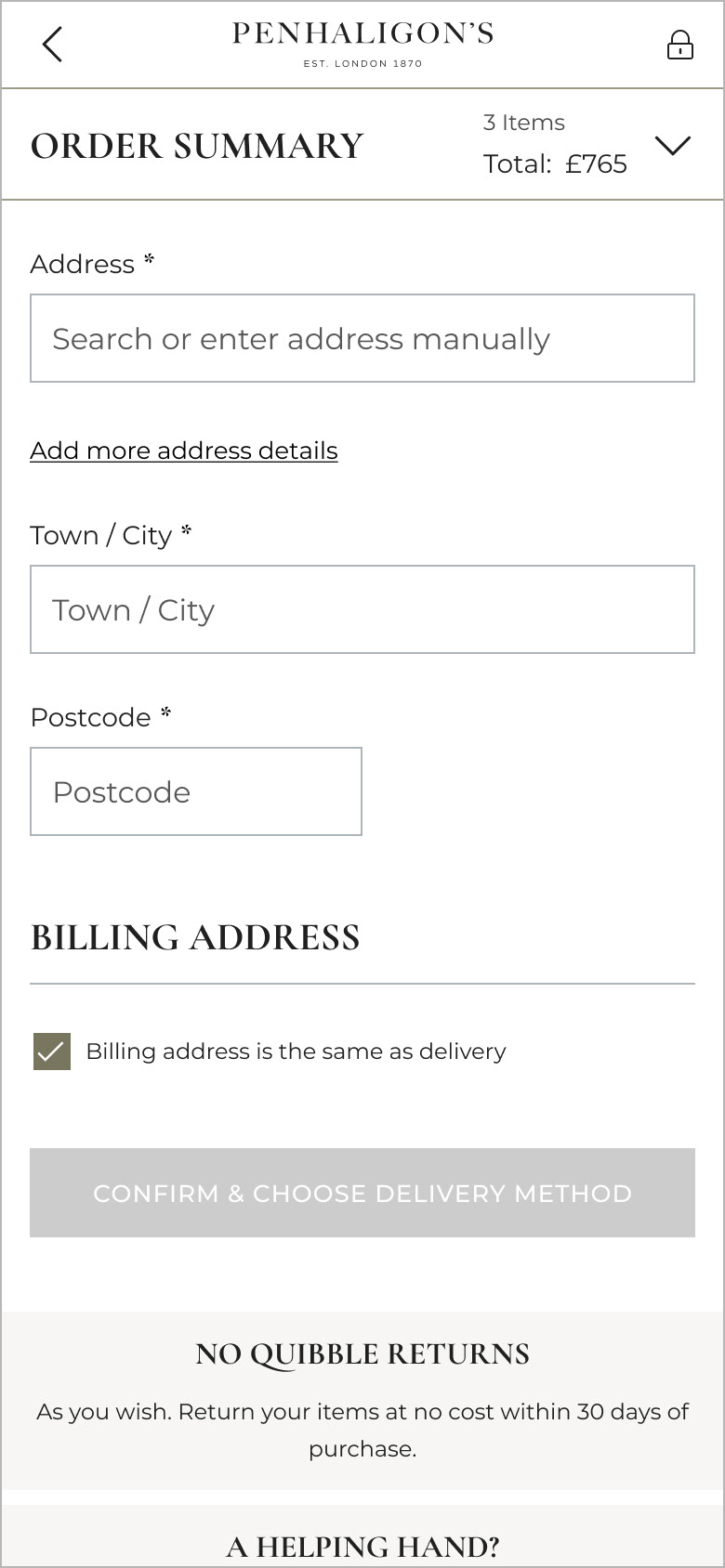
Address form — Pre-selected the country field and progressively disclosed optional fields, reducing cognitive load and form completion time.
Review order — Incorporated this into a preview that can be expanded on mobile, rather than an extra step in the journey.
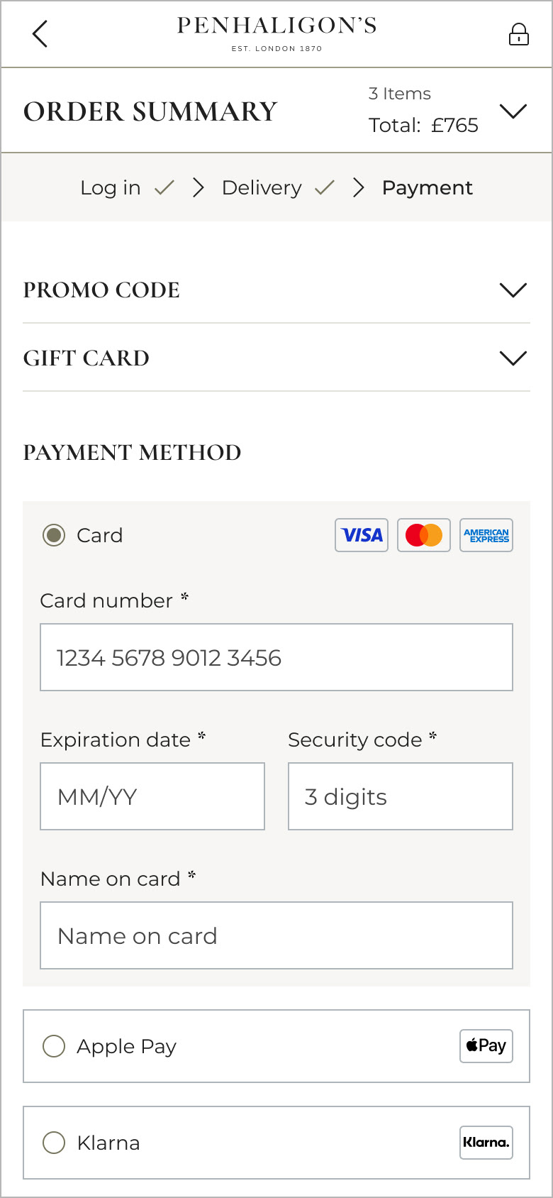
Payment — Displayed the card payment option expanded by default, reducing friction and lowering page exits.
Gifting Options — Moved gifting options to the cart to reduce steps and surface this information earlier in the journey, based on customer feedback.
UI Design